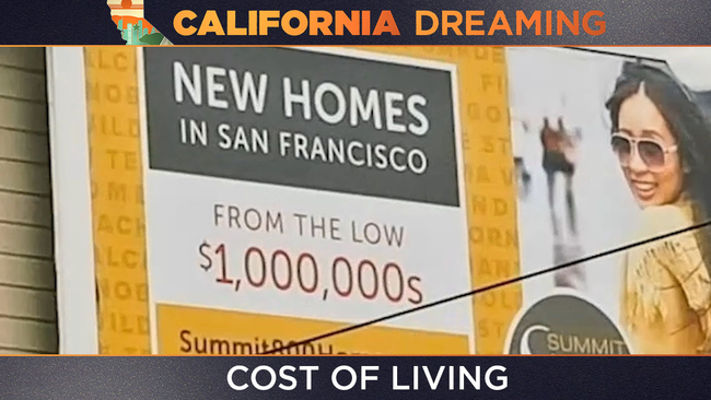
Rent is eating up a dangerous share of Californians' pay: This map shows how much


SAN FRANCISCO -- Ever hear of the financial advice that you should only spend one-third of your income on housing? For many Californians, that's just not possible.
In more than two-thirds of California zip codes, the typical family now spends at least 30% of its income on rent.
Explore every zip code in the embedded map below.
Having trouble viewing the map above? Click here to open it in a new window.
The darker the shade of red on the map, the higher the percentage of residents' income that is being spent on rent.
You might expect San Francisco -- one of the most expensive pockets of California -- to be lit up in dark red, but that's not the case. Rents are undoubtedly high in San Francisco, but so is the median income. Most zip codes see residents spending around 25% of their income on rent.
A few zip codes on the south side break from that pattern. 94132 -- the area around Lake Merced, for example -- has residents spending about 38% of their income on rent.
Other parts of the Bay Area show a similar mismatch between income and rent. Several zip codes in East Oakland show residents spending between 30% and 38% of their income on rent. The residents of 94063 in Redwood City also spend 38% of their income on rent on average.
In Antioch, rent is cheaper than much of the rest of the Bay Area. The median rent in the city's 94509 zip code was $1,498 in 2018. But incomes are also lower in Antioch, so people are spending roughly 38% of their income on rent. That's way up from 29% in 2000, showing how much the region's cost of living has changed over the past two decades.
The areas around UC Berkeley and Stanford also show up as dark red on the map, likely because of the high density of students who report low or nonexistent incomes and pay high rent.
The map in this story was created as part of ABC Owned Television Stations' "California Dreaming" five-part series, which explores how the issues of affordability, wildfires, earthquakes and more have reinvented the California dream.
See a sneak peak of the series in the video player at the top of this story or stream all five episodes on our connected TV apps (Roku, Amazon Fire TV, Apple TV, Android TV).